During a recent project I came upon an interesting CSS problem. I needed to create a square element that would maintain its square shape as it responsively resized to a changing window size.
The Problem
It is easy to create a square when we can explicitly declare its
'width'and 'height':
CSS
However, when we try to make our square element responsive by changing our units to percentages, we run into a problem:
CSS
The element’s width is calculated as a percentage of its parent’s width, while its height is calculated as a percentage of its parent’s height. Because our width and height are calculated from different measurements, the square will no longer hold its shape.
The Solution
After quite a bit of searching, I came upon a surprising solution to the problem. By making use of the
:after pseudo-element and 'padding-bottom', we can create our responsive square using only CSS.
The solution relies on the somewhat counterintuitive fact that padding is calculated as a percentage of its parent element’s width, not height. This rule applies, even for
'padding-top' and 'padding-bottom', despite being vertical measurements.
To capitalize on this fact, we must first remove the
'height' property from our .square element. In its place, we add an empty :after element to .square and set 'padding-bottom: 100%':
CSS
Because the pseudo element’s padding is calculated as a percentage of its parent’s width, and its parent is our
.square element, we are effectively fixing the height of the pseudo-element to the width of .square. Whenever .square’s width changes, so will the pseudo-element’s height.
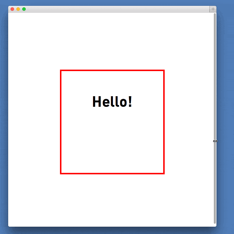
Adding Content
Finally, we might like to add some content to our
.square element. The above solution relies on both .square and .square:after having a height of 0, so adding content to either of them would break our solution.
Fortunately, this problem is easily solved by creating an absolutely positioned element and placing it within
.square. The new element can be sized to match the square, but since it is absolutely positioned, its content will not affect the dimensions of our square:
CSS
No comments:
Post a Comment