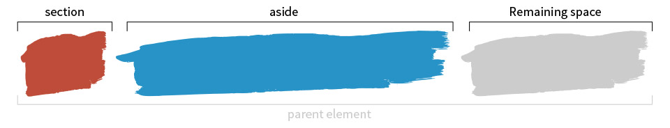
<main> <section>Lorem ipsum dolor sit amet, consectetur adipisicing elit. Aperiam quod cupiditate saepe tempora incidunt, id nobis iure? Neque harum illum voluptatibus a numquam, nihil asperiores, amet provident magni minima tempore!</section> <aside>150px</aside> </main>
CSS
main { display: flex; margin-bottom: 20px; } section { flex-grow: 1; } aside { flex-basis: 150px; flex-shrink: 0; /* flex-shrink: 0; prevents the aside from shrinking, if the section attempts to grow due to its content. (see third example) */ /* Instead of flex-basis: 150px; and flex-shrink: 0; you can use the shorthand: */ /* flex: 0 0 150px; */ }
The following is a guest post by Manuel Matuzovic. It illustrates how flex-grow works, weird quirks and all. Then he goes into several examples on how common layout patterns may be implemented using flex-grow and flex-basis.
When I found out about flex-grow, I made a simple demo to find out what it did and how it worked. I thought I got everything figured out, but when I tried it on a website a colleague has recently made, nothing worked as expected. No matter what we did, the layout didn't look and work like it did in my demo. That got me thinking and I started to doubt that I knew what flex-grow was all about.
Before we are going to take a deep dive into the functionality of flex-grow, I want to explain to you what I got wrong at first.
I thought that all flex items with flex-grow set to 1 would have an equal width. If one of the items had flex-grow set to 2 that item would be twice as big as all the others.
This sounds great. It seems as if this is exactly what's happening in the Pen I mentioned before. The parent element is 900px wide, the section with flex-grow: 2 has a calculated width of 600px and the aside element with flex-grow: 1 has a calculated width of 300px.
As you can see, everything works out perfectly in this demo, but it did not work at all in a real life example, even though we used the exact same CSS. As it turns out, the problem wasn't the CSS, but the content (or lack of content). The demo I made works, because by only using two empty elements I created a test case that was too simple to depict the important specifics of the property.
I just described how flex-grow does not work, but I showed you a demo that actually does do what I claim it does not (Later on in this article I will explain the reason for this.).
To clarify things, let me show you another Pen. We have got the exact same setup as in the first pen, but this time the section and aside elements aren't empty. Now the ratio isn't 2:1 anymore and the element with flex-grow set to 1 is actually bigger than the element with flex-grow set to 2.
Explanation
If we apply display: flex; to the parent element and don't change anything else, the child elements will be stacked horizontally, no matter what. If there isn't enough space, they will shrink in size. If on the other hand there is more than enough space, they won't grow, because Flexbox wants us to define how much they should grow. So rather than telling the browser how wide an element should be, flex-grow determines how the remaining space is distributed amongst the flex items and how big the share is each item receives.
Or in other words:
A flex container distributes free space to its items (proportionally to their flex grow factor) to fill the containers, or shrinks them (proportionally to their flex shrink factor) to prevent overflow.
The concept is much easier to understand if we visualise it.
First we set the display property of our parent element to flex and by doing that our child elements become flex items and are positioned horizontally next to each other.
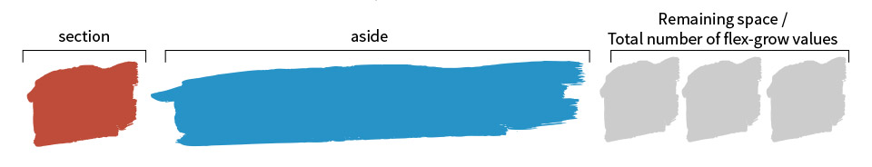
Next we decide how many shares of the extra space each element receives. In our previous example the first element receives 2/3 of the remaining space (flex-grow: 2) and the second element 1/3 (flex-grow: 1). By knowing how many flex-grow values we have in total, we know by which number to divide the remaining space.
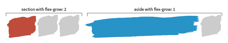
Finally we have the number of distributable pieces. Each element receives the appropriate number of pieces based on its flex-grow value.
Calculation
Theory and visual representations are nice, but let's get dirty and do the math for the above example.
For our calculation we need 4 numbers: The parent width, the initial width of our section and our aside element and the total number of flex-grow values we'll use.
2. Next we have to determine how much one flex-grow is
Now that we have the remaining space we need to determine into how many slices we want to cut it. The important thing here is that we don't divide the remaining space by the number of elements, but by the number of total flex-grow values. So in our case that's 3 (flex-grow: 2 + flex-grow: 1)
178 / 3 = 59.33
remaining space / total flex-grow values = “one flex-grow”
3. Finally the sliced up remaining space gets distributed between all elements
Based on their flex-grow values the section receives 2 slices (2 * 59.33) and the aside 1 (1 * 59.33). These numbers are added to the initial width of each element.
99 + (2 * 59.33) = 217.66 (≈218px)
initial section width + (section flex-grow value * “one flex-grow”) = new width
and
623 + (1 * 59.33) = 682.33 (≈682px)
initial aside width + (aside flex-grow value * “one flex-grow”) = new width
If the width of each element is 0, the remaining space equals the actual width of the parent element and thus it looks like flex-grow divides the parent element's width in proportional parts.
Just a quick recap: flex-grow will take the remaining space and divide it by the total amount of flex grow values. The resulting quotient is multiplied by the respective flex-grow value and the result is added to each child elements initial width.
But what if there's no remaining space or what if we don't want to rely on the elements initial width, but on a value we set? Can't we still use flex-grow?
Of course we can. There is a property called flex-basis which defines the initial size of an element. If you use flex-basis in conjunction with flex-grow the way the widths are calculated changes.
<‘flex-basis’> This component sets the flex-basis longhand and specifies the flex basis: the initial main size of the flex item, before free space is distributed according to the flex factors.
The big difference if we apply flex-basis to an element is that we don't use its initial width in our calculation anymore, but the value of its flex-basis property.
I have adapted our previous example by adding flex-basis to each element. Here's the Pen for you.
So to cover everything, let's check out what happens if we add padding and margin. Nothing too special actually. In the first step of the calculation you just have to remember to subtract the margins as well.
The only thing to note is that in terms of box-sizingflex-basis behaves like the width property. That means that the calculation as well as the results change if the box-sizing property changes. If box-sizing was set to border-box, you would only work with the flex-basis and margin values in your calculation, because the padding is already included in the width.
Alright, enough with the math. Let me give you some examples of how you're able to establish flex-grow effectively in your projects.
No more width: [ x ]%
Due to the fact that the remaining space gets distributed automatically, we don't need to think about width values anymore, if we want our child elements to fill the parent element.
The “Holy Grail” 3 column liquid layout with pixel-widths
Mixing fixed and fluid widths in column layouts is possible with float, but it is neither intuitive or easy nor flexible. Of course with Flexbox and a little flex-grow and flex-basis magic that is a piece of cake.
Filling remaining space with any element
If you, for example, have an input field next to a label and you want the input field to fill the rest of the space, you don't need ugly hacks anymore.
According to the specs, we should use the flex shorthand rather than flex-grow directly.
Authors are encouraged to control flexibility using the flex shorthand rather than flex-grow directly, as the shorthand correctly resets any unspecified components to accommodate common uses.
But be careful! If you just use flex: 1; some of the above examples won't work anymore, because the values set for the common uses don't equal the default values and thus interfere with our needs.
If you want to use flex for our use case, you should define it like this:
Is flex-grow weird? Nah, not at all. We just have to understand how it works and what it does. If an element has flex-grow set to 3 it does not mean that it's 3 times bigger than an element that has flex-grow set to 1, but it means that it gets 3 times more pixels added to its initial width than the other element.
I learned my lesson by testing flex-grow with two empty elements, which gave me a completely different understanding of what the property actually does and this of course led to wrong conclusions. You should check out new stuff in an environment that is as realistic as possible, to get the best impression of how it really works and behaves.
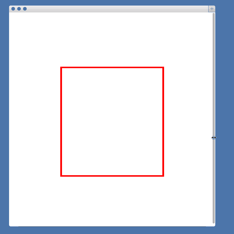
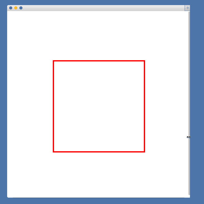
During a recent project I came upon an interesting CSS problem. I needed to create a square element that would maintain its square shape as it responsively resized to a changing window size.
The Problem
It is easy to create a square when we can explicitly declare its 'width'and 'height':
CSS
.square{width:100px;height:100px;}
However, when we try to make our square element responsive by changing our units to percentages, we run into a problem:
CSS
.square{width:50%;height:50%;}
The element’s width is calculated as a percentage of its parent’s width, while its height is calculated as a percentage of its parent’s height. Because our width and height are calculated from different measurements, the square will no longer hold its shape.
The Solution
After quite a bit of searching, I came upon a surprising solution to the problem. By making use of the :after pseudo-element and 'padding-bottom', we can create our responsive square using only CSS.
The solution relies on the somewhat counterintuitive fact that padding is calculated as a percentage of its parent element’s width, not height. This rule applies, even for 'padding-top' and 'padding-bottom', despite being vertical measurements.
To capitalize on this fact, we must first remove the 'height' property from our .square element. In its place, we add an empty :after element to .square and set 'padding-bottom: 100%':
Because the pseudo element’s padding is calculated as a percentage of its parent’s width, and its parent is our .square element, we are effectively fixing the height of the pseudo-element to the width of .square. Whenever .square’s width changes, so will the pseudo-element’s height.
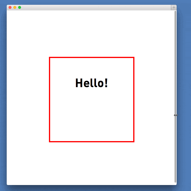
Adding Content
Finally, we might like to add some content to our .square element. The above solution relies on both .square and .square:after having a height of 0, so adding content to either of them would break our solution.
Fortunately, this problem is easily solved by creating an absolutely positioned element and placing it within .square. The new element can be sized to match the square, but since it is absolutely positioned, its content will not affect the dimensions of our square: